Every organisation today has dashboards. They are on screens, in meetings, built into apps, tracking everything from sales to production metrics. Yet paradoxically, decisions are still slow. Why?
The Problem: Beautiful Charts Does Not Mean Better Decisions
- According to a recent survey on analytics and dashboard usage, while 78% of organizations use dashboards to monitor their data, only 50% of users engage with them daily, and overall satisfaction averages just 3.6 out of 5. luzmo.com
- Many dashboards still face significant usability issues: 51% say dashboards lack meaningful ways to interact with data; 37% say the data shown is not clear or actionable. luzmo.com
- In short: lots of effort goes into building dashboards, but many remain underused because business users cannot easily interpret what they see. The data is there, but the story is not.
- As one expert puts it, dashboards succeed when they are “Functional – Informative – Engaging.” Medium
What’s Missing
It is not just about showing numbers or trend lines; it is about enabling decisions. The missing link?
- Context and narrative: A chart shows a dip in sales, but why did it happen?
- Interactivity and focus: Users need to ask questions that matter and get direct answers, not dig through multiple visuals.
- Speed: In today’s fast-moving business world, waiting hours (or days) for an analyst to interpret data means missed opportunities.
So, what is the Shift?
Enter the era of augmented analytics, where dashboards do not just display data; they interpret it. Wikipedia Businesses are now demanding dashboards that do more than look good: they want dashboards that speak, that guide, that surface insight automatically.
Introducing the Solution: Smarter Dashboards That Talk Back
That leads us to the idea of dashboards not as passive displays but as decision-assistants. Imagine: one clicks and your dashboard gives you a summary of what matters. Ask a question say, “Why did churn increase last quarter?” and get a clear, focused answer that points you to root causes, not just numbers.
Why It Matters Across Roles
- Boardrooms: Start a meeting with a ready-made summary. No analyst deck prep.
- Sales/Marketing: Spot emerging trends even before the campaign review begins.
- Operations: Surface root-causes from production dashboards without waiting for a specialist.
- E-commerce / Retail: Pinpoint growth drivers and churn risks in real-time dashboards.
- Healthcare / BFSI: Get compliance-friendly highlights without manual effort.
Bringing It All Together – Introducing DataV AI Insights
With this thinking in mind, we built DataV AI Insights, a feature that transforms your dashboards from static displays into decision-ready intelligence.
- Click once — Instantly generate clear, bullet-point insights for the full dashboard.
- Ask a question — Focus on any chart, any metric, any visualization and get a precise answer. No more guessing what a chart means. Now your dashboard reads itself and delivers the story. Your dashboards do not just show data, they now come with context baked in.
What You Get
- Zero Effort: One clicks and your dashboard tells you what matters.
- Focused Answers: No generic commentary, just laser-sharp responses aligned with what you care about.
- Human Readable: Insights written in plain, crisp business language ready for action. Decision-Ready: Move from “what the numbers are” to “what we do next.”
Why Now?
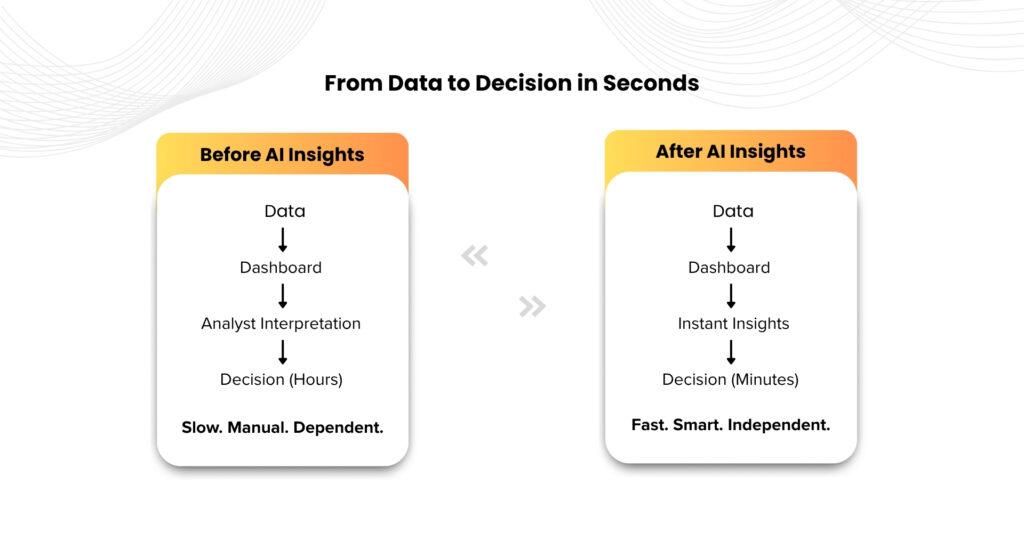
Because in modern business, speed matters. A delay in insight is a missed competitive edge. With dashboards that require interpretation, time slips by. With DataV AI Insights, hours of chart-reading turn into seconds of clarity. This is not just “analytics 2.0”, it is your dashboard’s built-in decision assistant.
Insights. Instant. Impact.
Insights. Instant. Impact.
Want to See It in Action?
Your dashboards have already captured the data. Now let them tell the story.
Book a demo: https://datav.in/
Book a demo: https://datav.in/